
Objective.
Our team was approached by Trellus Health to enhance their presence in the health and wellness industry and optimize user experience. The existing website, built on a basic Wix template, was outdated and lacked both visual appeal and technical functionality.
Goal.
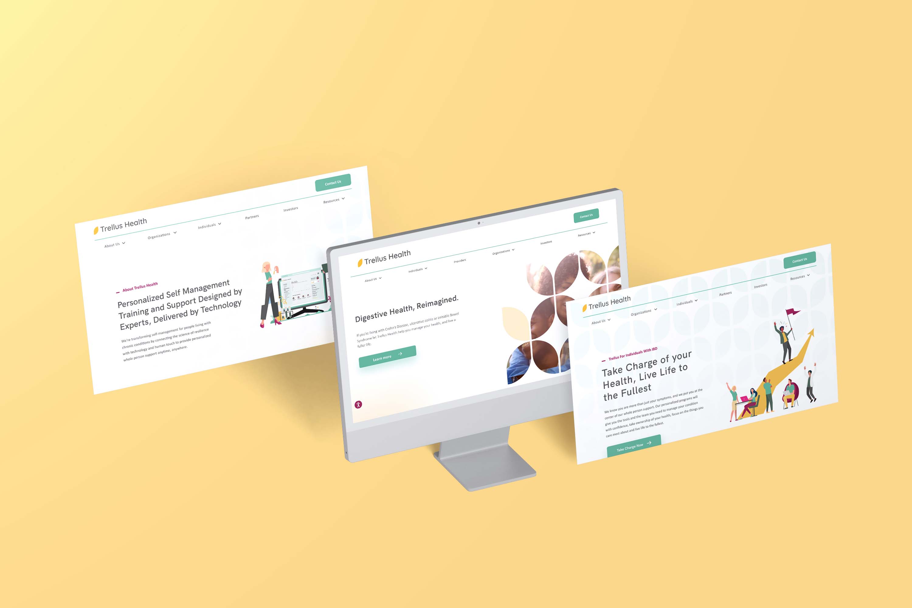
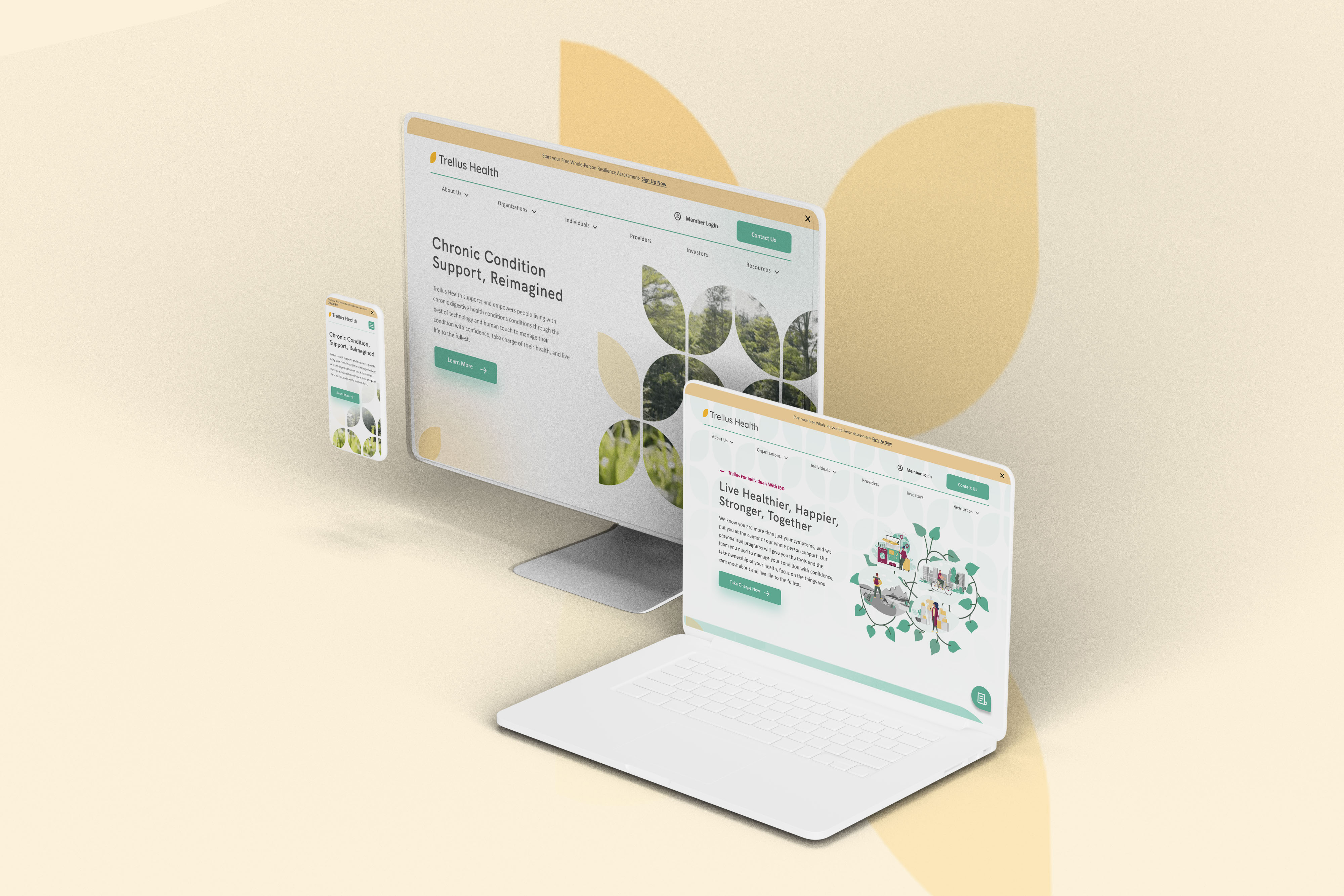
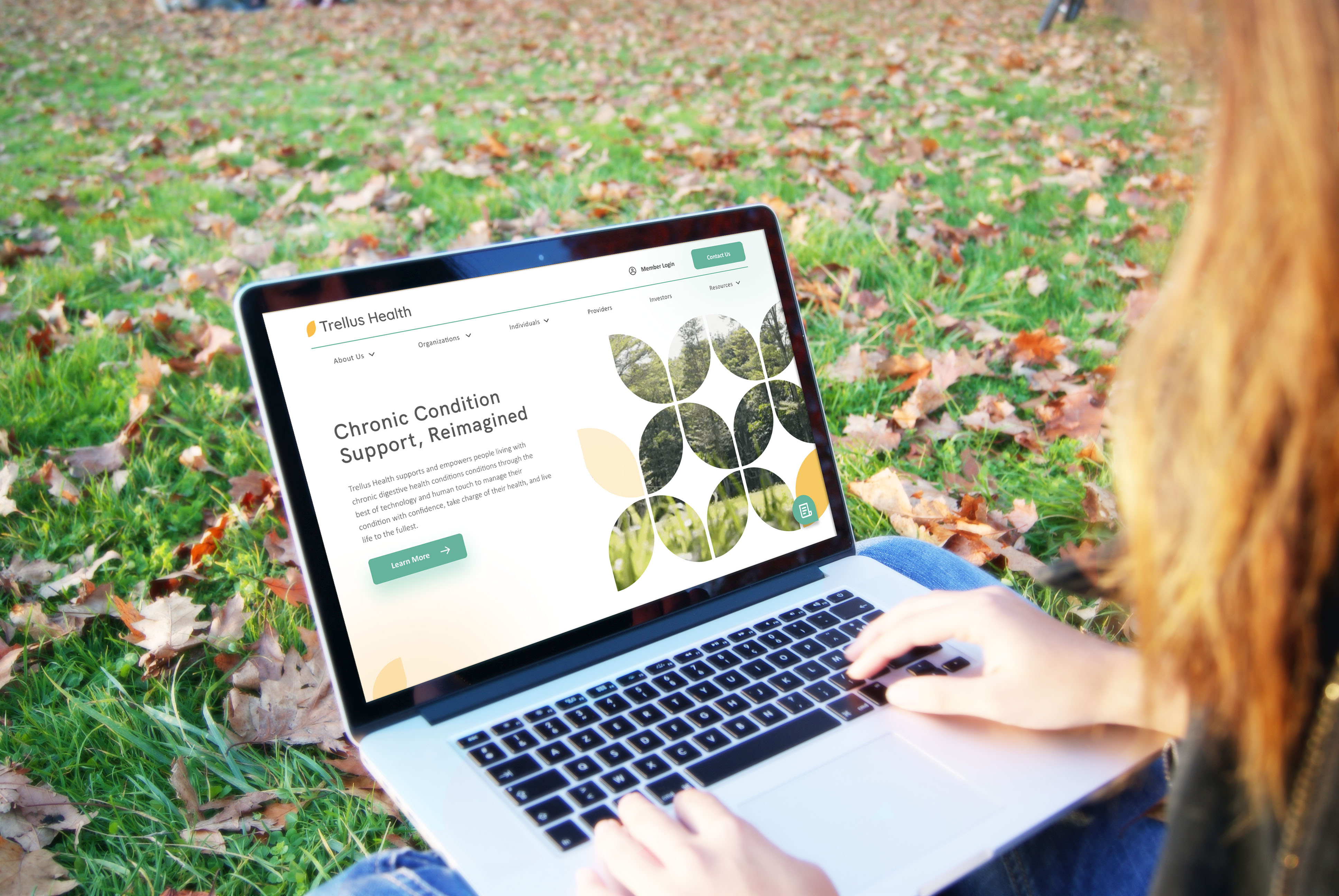
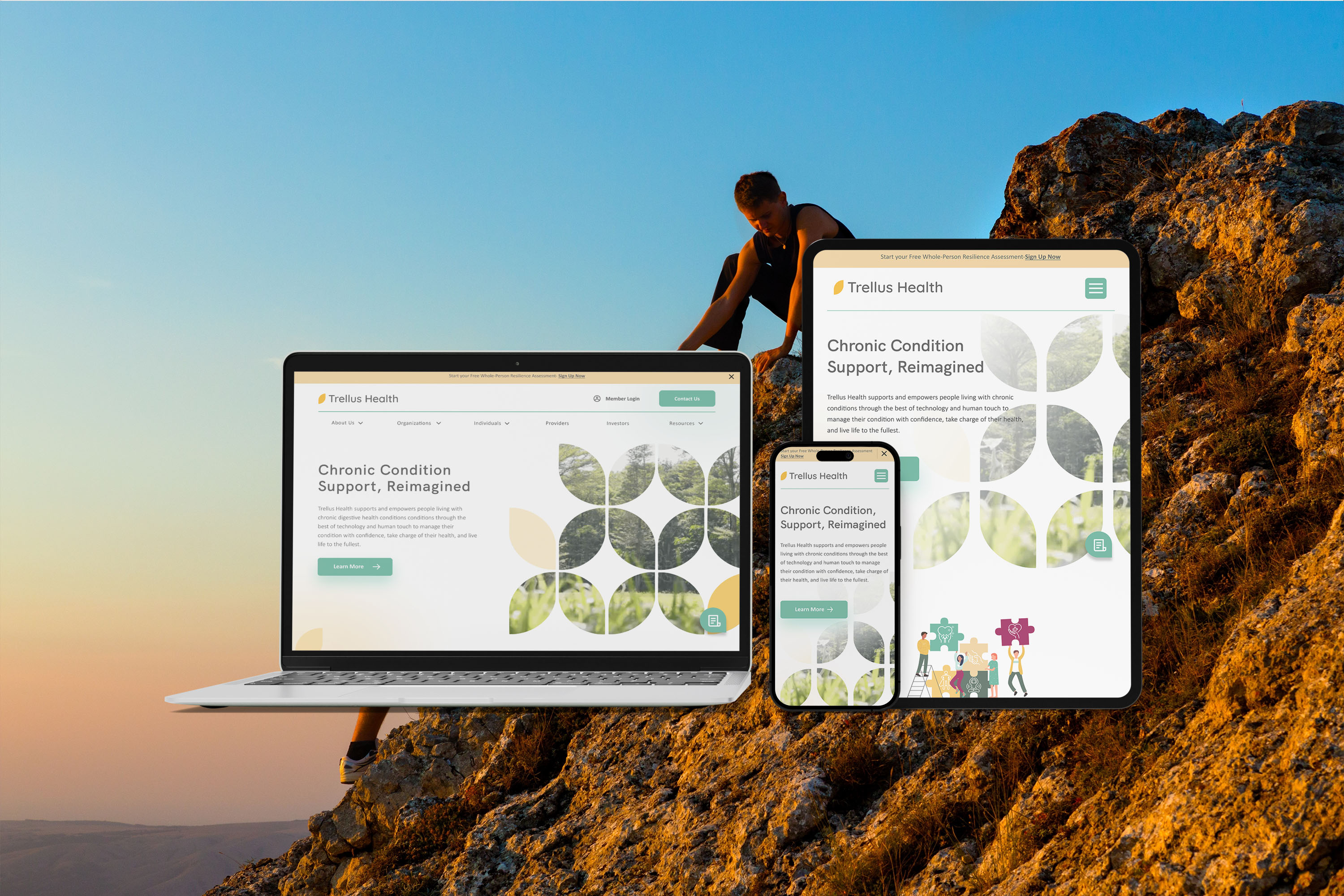
We took on the task of bringing a more prominent branding element to the new Trellus Health website. Since Trellus Health was a startup company with minimal branding guidelines, limited to a color palette. While collaborating with their in house designer we aimed to create a design that reflected their friendly, knowledgeable, and family-oriented approach. To achieve this, we leveraged their logo mark and the concept of a "trellis" to develop captivating patterns. Additionally, we employed generous amounts of clean white space throughout the site to provide users with a soothing and comfortable browsing experience.
Information Architecture.
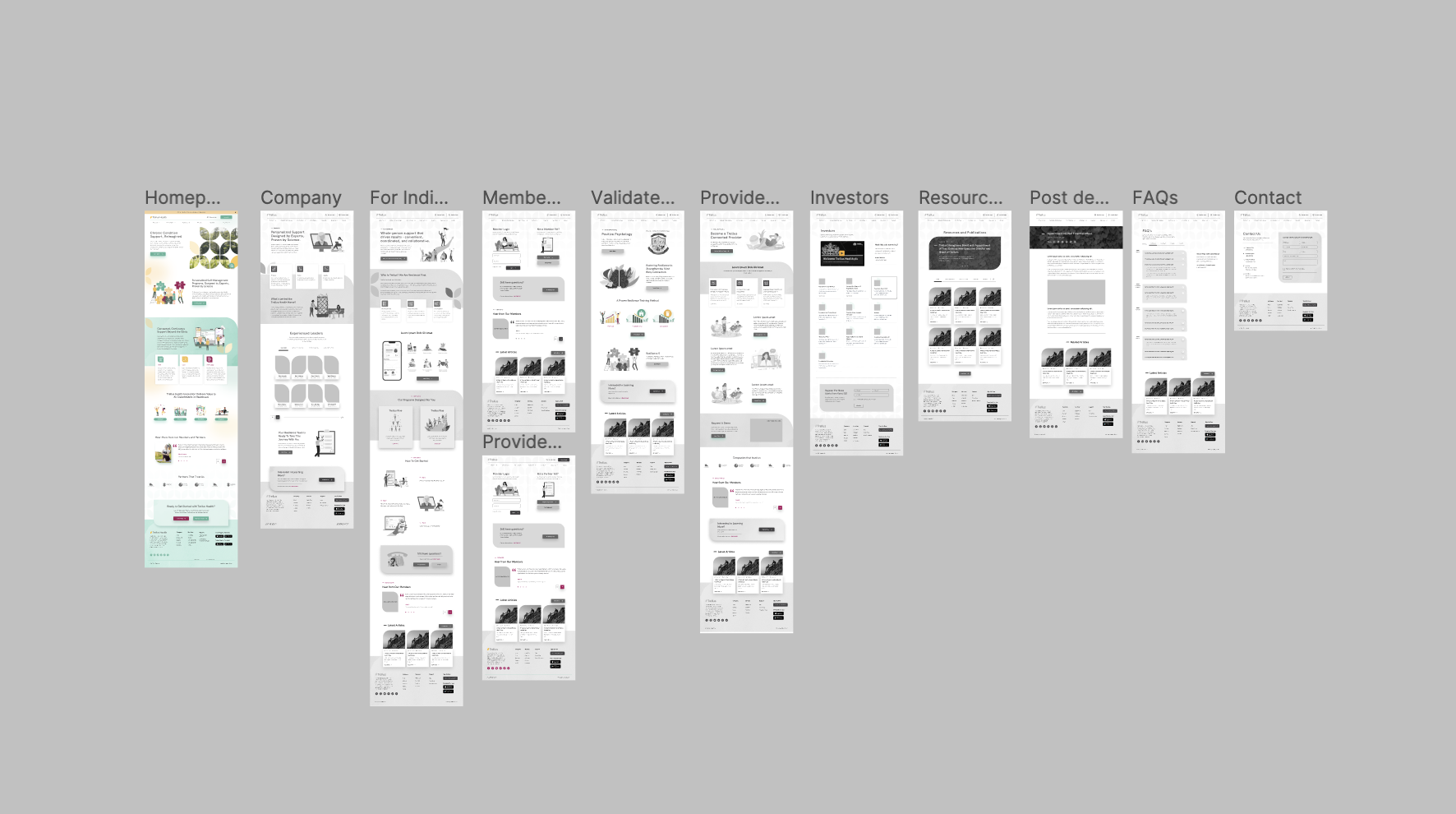
During the site-mapping phase, our team determined that the most effective approach for the revamped website was to categorize certain pages under dropdown menus. This decision was made to prevent the navigation from becoming overcrowded. Given Trellus Health's wide range of solution offerings, we wanted users to have the ability to filter services based on whether they were targeting Individuals or Organizations.
In response to the client's request, we designed the navigation to provide a sense of hierarchy by separating the services into "Organize Services." This restructuring allowed users to navigate the website according to their specific needs. Additionally, we ensured that the new layout facilitated easy access for users to request a free assessment, enabling them to initiate their journey with Trellus Health.

Wireframes.
Once I had a general concept of the app's flow, I proceeded to create preliminary wireframes to gain a better understanding of its practical functionality. Throughout this process, I remained mindful of the user feedback I had already received.
Design Concept.
The designs for Trellus Health were centered around a clean and minimalistic user interface (UI). This aesthetic was made possible by selecting simple typefaces that accurately represented the brand. Our goal was to use illustrations instead of imagery to convey the desired friendly atmosphere and highlight the intricate details of Trellus's resilience training program.
Results.
Despite experiencing some delays in launching this project due to internal feedback from the Trellus board of directors, we successfully delivered a product that surpassed the client's expectations. They were ecstatic with the improved design and its impact.
Throughout this project, I was challenged to swiftly implement changes to meet the evolving requirements while still adhering to the set deadline. This experience honed my ability to make rapid adjustments without compromising the project timeline.